In my 2D design classes, I often try to convey the idea the design is not about having a perfect first idea and then running for tools to put it together. Rather, it is a progressive, incremental evolution that involves options that may appear, disappear, split off to become new work, or change drastically from one version to the next until one has the final “finished” piece.
Well, this is easy to preach, but being a visual artist I find it often better to show…
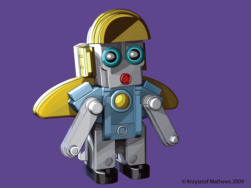
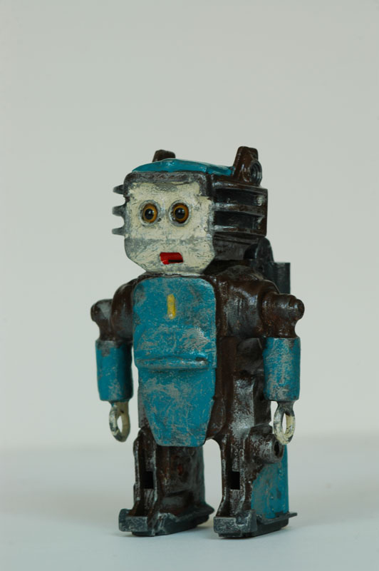
The piece for today is an image that like many of my ideas began with a sculpture.

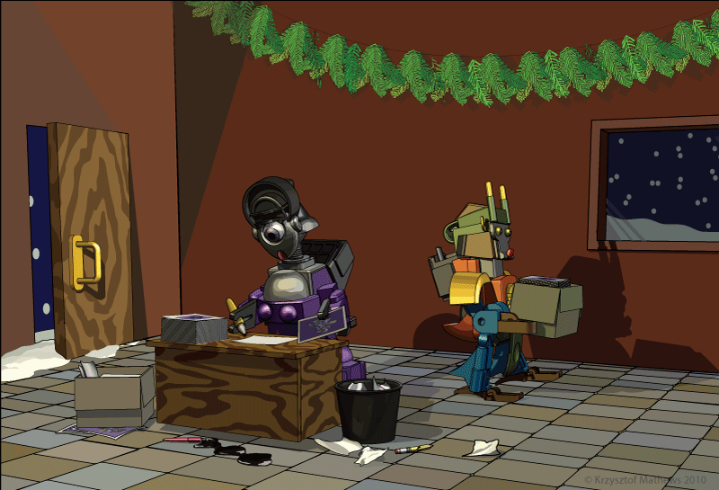
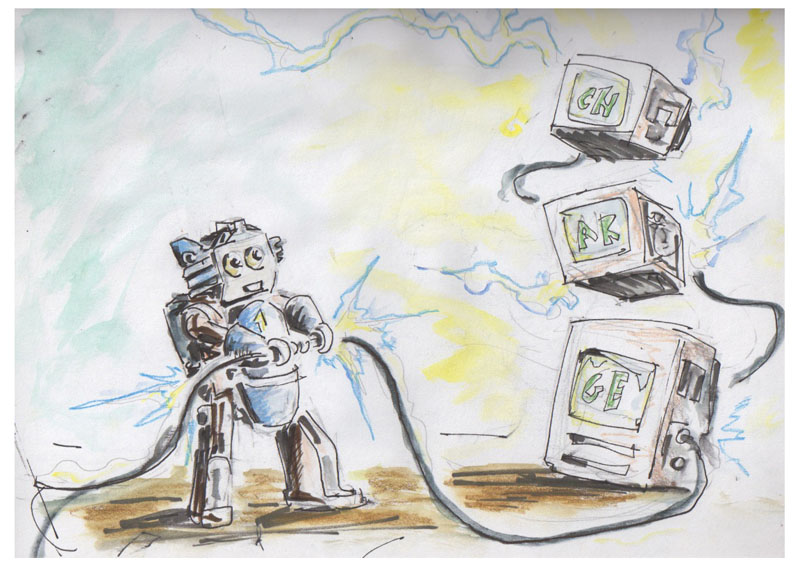
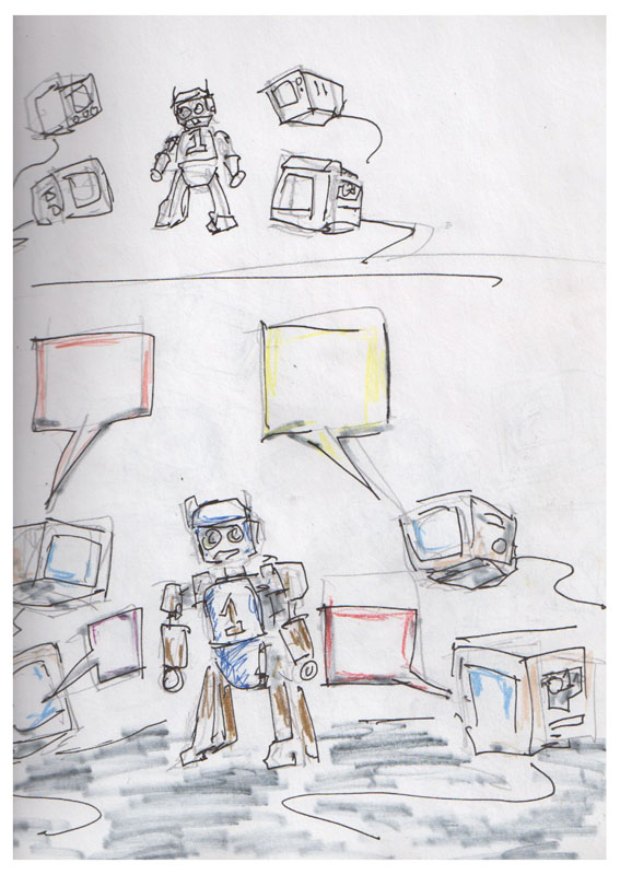
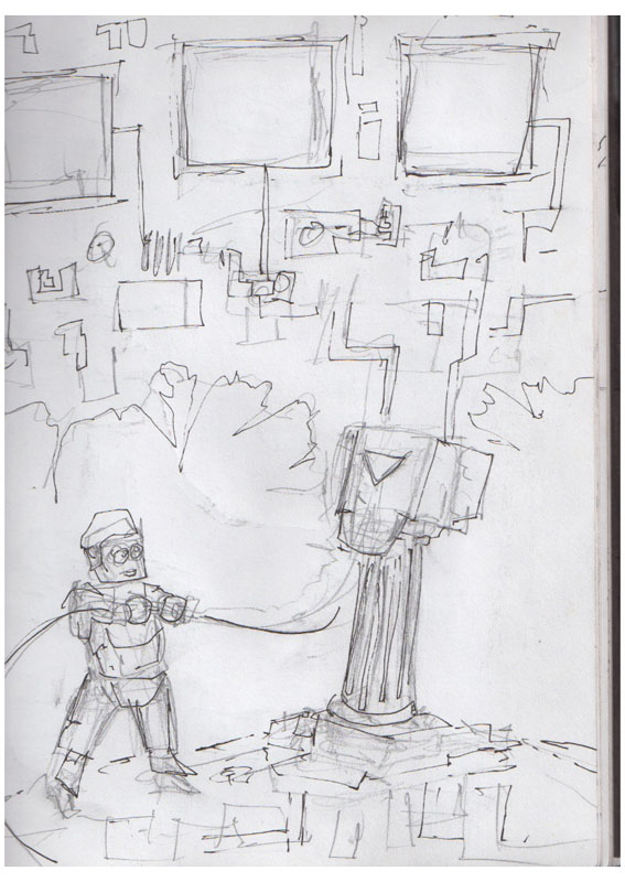
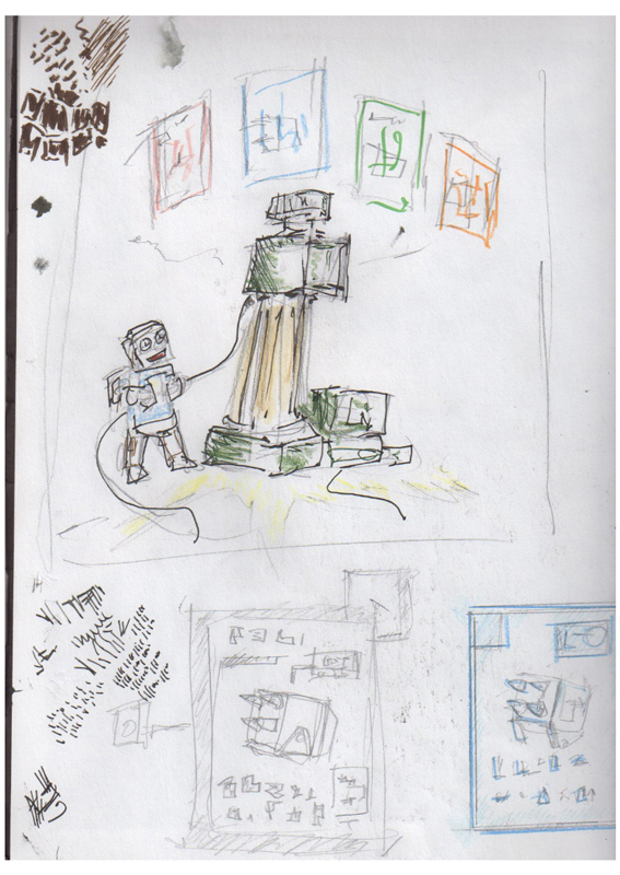
This little fellow sat on my desk for a series of sketches. From the beginning, he seemed like some sort of worker or engineer. The original conception had him interacting with some sort of computer monitors..


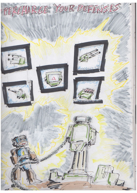
Now the first sketch already brings in the phrase “Supercharge!” Notices that it disappears from future sketches..
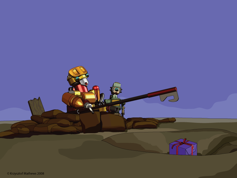
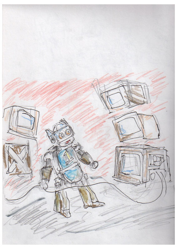
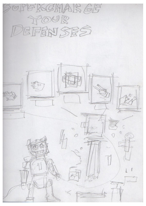
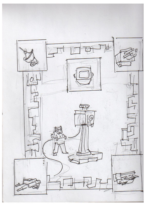
Now the next set of sketches significantly changes the scene. I now bring in an emplacement, rather than a set of monitors.


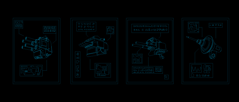
The phrase “Supercharge your Defenses” now appears. You also will see a conception of images like what one might find as details from a technical manual, within a structure of mechanical lines and edges.
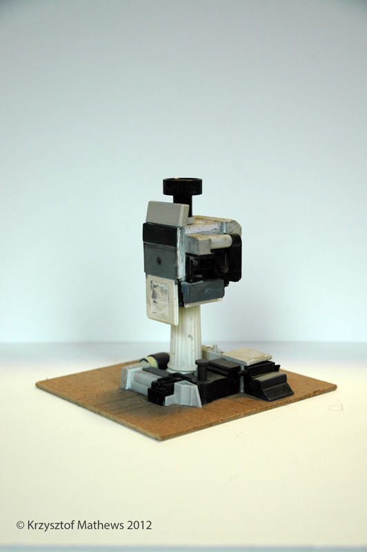
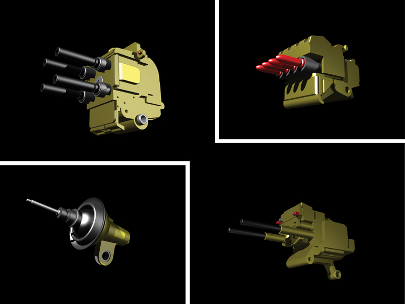
The actual structure itself is based, like the featured figure, on a sculptural model. In this case, the un-surfaced model that you see below:

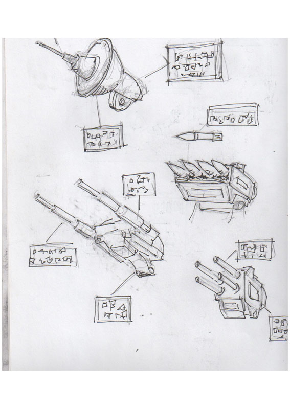
Now the next phase involves making some choices about the items in the boxes. We see a sketch here, as well as a preliminary render and a redraw in illustrator in for the appearance thereof..


Now here we see where I had been experimenting to reckon how to best integrate these graphics.


And then I had a very auspicious meeting with a friend of mine. In a separate post, I mentioned my friend Ian Wells, a fellow illustrator and designer with a very keen sense of composition. As I showed him some of my initial renders from the computer and sketches, he had three strong observations:
1.) The piece needed more depth, more lead ins to engage the viewer.
2.) The mechanical border was indeed intriguing, but it could actually serve as the basis for an entirely different piece.
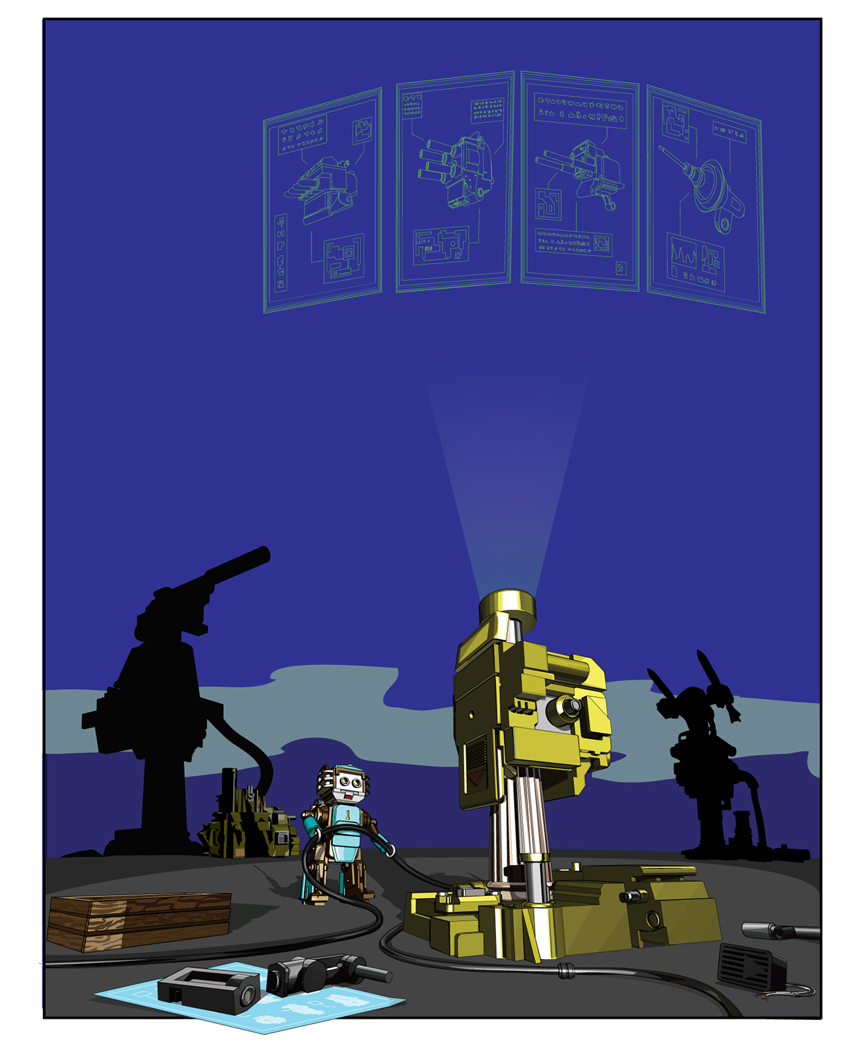
3.) Rather than have the images of the emplacement parts with hard borders, what if the were instead a holographic display that implied rotation in space?
This is the sort of dialogue that is absolutely crucial. In my classes, I tell my students that it is very easy to become attached to one’s own designs, to the exclusion of other options or the failure to recognize certain weaknesses. Having folks who can give honest and informed feedback is essential, and in this case it made a tremendous difference!
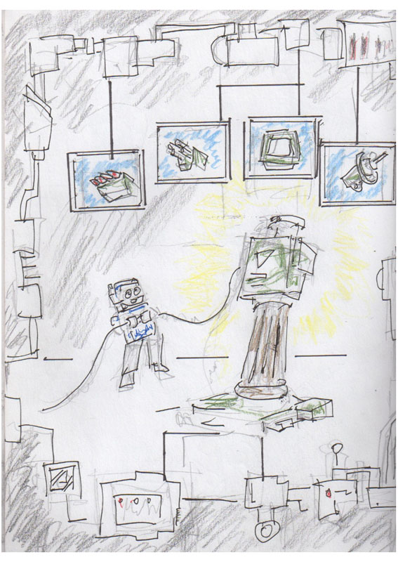
I immediately got to work sketching..This was what came forth..

Note the arc form of the graphics, and the colorful ethereal quality at work.
I completed the final illustration in August of 2015, and had it printed that month. A week later it was accepted into the Warwick Museum of Art’s Open Juried Annual show, and this December it was accepted into the East Greenwich Library’s juried “Winter’s Eve” show.
Here is what the final piece looks like:

I present this lengthy account because I want to share the sense of how much work and process goes into the act of creating artwork with a design sensibility.
Many beginning artists labor under the false conception that great art should simply spring forth like Athena from the Head of Zeus. Rather, if one sees the process of creation as a journey in which there are sidetracks, detours, and even splits in the road to be explored, this can ultimately be a very effective and rewarding working method.
And what of those first sketches with the monitors? Well they indeed have spawned an entirely different piece of art, as yet to be revealed!..
